library(tidyverse)

ggplot(data = mpg, mapping = aes(x = displ, y = hwy, color = drv)) +
geom_point()Slow down, simplify and do small things
advice
Hi everyone!
Now that we’re at the middle of the course, your plots and data manipulation are becoming more detailed and complex, which is good! Remember exercise 1, so long ago? All you had to do was this:
That’s all! Literally 3 lines of code.
But now with your mini projects, and (in the future) interactivity, maps, text analysis, and your final project, your code is getting longer and more complex. You’ll have lots and lots of ggplot layers and functions chained together with |>. You’ve learned so much!
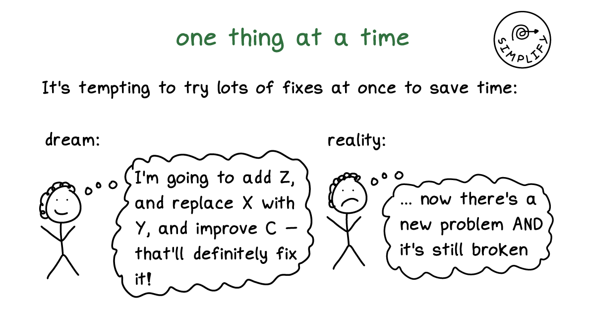
It is incredibly tempting to write out all the code you want in one go and then try to run a complete chunk and hope that you got it all correct. And then when it’s not correct, you try to change a bunch of things, hoping that they’ll fix it and then they don’t and you stay stuck and frustrated. You’ll have a chunk of code that was 20–30 lines with an error somewhere and won’t be able to find what went wrong or what was broken.
Don’t do this!
Here’s my best piece of advice for making more complex plots and for figuring out how to fix errors:
Slow down, simplify, and do small things
Run your code incrementally (see this past post here for some video examples about how to run stuff incrementally.). Start with a super basic plot and run it, then add a layer for labels and run it, then add a layer to change the fill gradient and run it, then add a layer to change the theme and run it, and so on. It feels slow, but it helps you understand what’s going on and helps you fix things when they break.
This is not just my advice. Julia Evans’s fantastic The Pocket Guide to Debugging has the same piece of advice:
When something doesn’t work as expected, change just one thing at a time. Or even better, simplify it and then change one thing at a time.
Here’s a quick common example. Let’s say you have a plot like this and you want to use the plasma viridis scale for the colors of the points. It looks like it should work, but the colors aren’t right! Those are just the default colors!
library(tidyverse)

ggplot(data = mpg, mapping = aes(x = displ, y = hwy, color = drv)) +
  geom_point() +
  labs(x = "Displacement",
       y = "Highway MPG",
       color = "Drive") +
  scale_fill_viridis_d(option = "plasma", end = 0.9) +
  theme_minimal() +
  theme(legend.position = "bottom")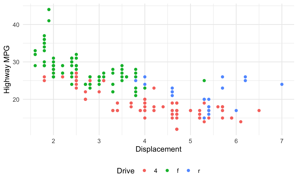
Here’s the process I would go through to figure out what’s wrong and fix it:
Right now there are a bunch of other layers (themes, labels, etc.). Maybe one of those is messing stuff up? We want to make sure the underlying plot works fine, so we’ll strip down the plot to its simplest form—just the geoms
ggplot(data = mpg, mapping = aes(x = displ, y = hwy, color = drv)) +
  geom_point()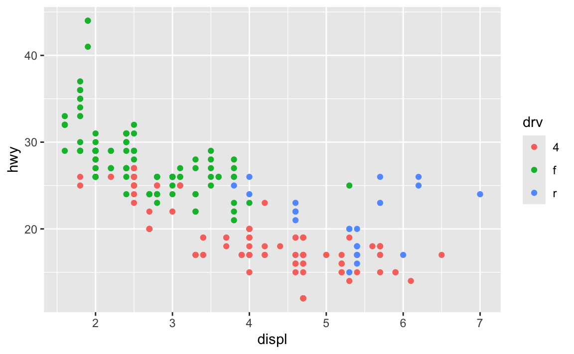
Good, that works. Next we want to change the colors so that they use the viridis plasma palette. We used scale_fill_viridis_d() originally, but we also included a bunch of extra options (option = "plamsa", end = 0.9). Before using those, let’s simplify it down and just use the default settings:
ggplot(data = mpg, mapping = aes(x = displ, y = hwy, color = drv)) +
  geom_point() +
  scale_fill_viridis_d()
The colors still didn’t change. But now we have a simplified working example of our broken code and we can examine it without worrying about the labels, themes, extra options, and all those other things. This should make it easier to see what’s going on.
The issue here is that we used the color aesthetic (color = drv) and we’re trying to change it with scale_fill_*(). That lets us control filled things (i.e. fill = drv). Since we’re working with the color aesthetic, we need to use scale_color_*(). Let’s try scale_color_viridis_d() and see if that fixes it:
ggplot(data = mpg, mapping = aes(x = displ, y = hwy, color = drv)) +
  geom_point() +
  scale_color_viridis_d()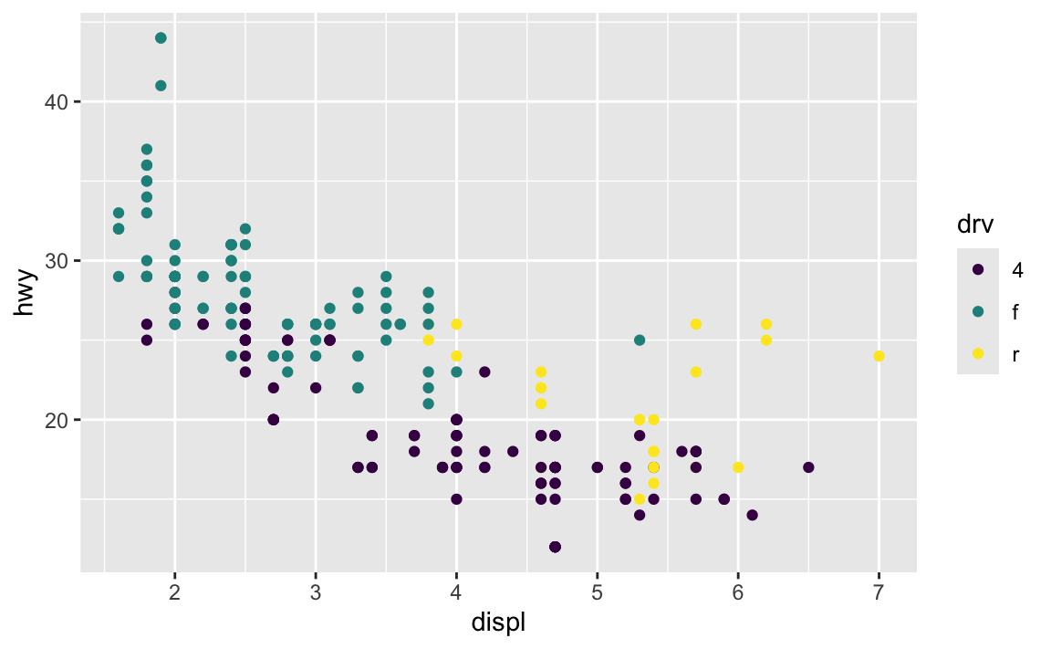
That fixed it! It’s still not exactly what we wanted yet—we want the plasma palette and end = 0.9—but it’s working now and we can add that back in:
ggplot(data = mpg, mapping = aes(x = displ, y = hwy, color = drv)) +
  geom_point() +
  scale_color_viridis_d(option = "plasma", end = 0.9)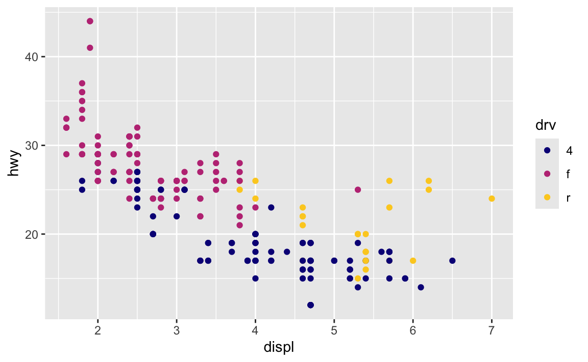
Cool, the palette changed and the other settings worked. The problem seems to be fixed now, so we can re-add all those other layers from the original plot. It’s fixed!
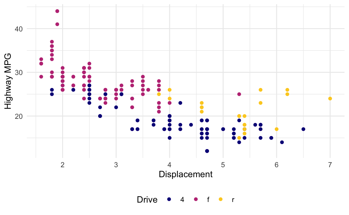
ggplot(data = mpg, mapping = aes(x = displ, y = hwy, color = drv)) +
  geom_point() +
  labs(x = "Displacement",
       y = "Highway MPG",
       color = "Drive") +
  scale_color_viridis_d(option = "plasma", end = 0.9) +
  theme_minimal() +
  theme(legend.position = "bottom")